The Silent Seducer: Unveiling the Psychology of Label Design
Your label is your silent seducer in the bustling marketplace, where countless products jostle for attention. The first impression grabs a customer’s eye, sparking interest and influencing that crucial purchase decision. But crafting a truly effective label goes beyond aesthetics; it delves into the fascinating realm of consumer psychology.
The Power of Perception: How Labels Speak Volumes
Our brains are wired to make snap judgments, and labels play a starring role in this cognitive theatre. Research by [Dijkstra et al., 2007] suggests that visual information processing takes a mere 13 milliseconds, meaning those initial moments spent looking at a product are critical. Here’s how label design leverages psychological principles to influence perception:
- Colour Psychology: Colours evoke emotions and associations. Red exudes excitement (think energy drinks), while blue conveys trust (financial products). Green signifies naturalness (organic foods), and yellow radiates happiness (children’s toys). Understanding these colour associations allows you to tailor your label’s palette to resonate with your target audience.
- Font Psychology: The font you choose isn’t just about readability. Serif fonts like Times New Roman lend a sense of tradition (luxury goods), whereas sans-serif fonts like Helvetica project a modern, minimalist vibe (tech gadgets). Script fonts can evoke elegance (beauty products) and playfulness (candy packaging).
- Imagery: High-quality visuals are powerful storytelling tools. A picture of a juicy steak on a frozen food package instantly triggers cravings. Images of happy families using a cleaning product build an association of domestic bliss. Using visuals strategically can create a powerful narrative around your product’s benefits.
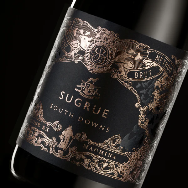
- Label Embellishments: Foiling and embossing powerfully exude a sense of quality and refinement, intricate detail and matt and gloss constrasts can attract attention.
- Whitespace: Don’t underestimate the power of empty space. A cluttered label feels overwhelming, while strategic use of whitespace creates a sense of balance and allows key information to stand out. Think of Apple’s minimalist packaging – clean lines and ample whitespace exude a premium feel.
Crafting a Winning Label: A Step-by-Step Guide
Now that we have explored the psychology behind label design, let’s translate theory into practice:
- Define Your Brand Identity: Start by clearly defining your brand personality, values, and target audience. This will guide your design choices.
- Research the Competition: Analyse the labels of your competitors. What are they doing well? What are the gaps you can exploit?
- Brainstorm and Develop Concepts: Explore different design ideas that resonate with your brand identity and target audience. Consider mood boards and sketches to refine your vision.
- Prioritize Clarity: Ensure key information like product name, brand logo, and benefits are presented clearly and concisely.
- Test and Refine: Don’t be afraid to conduct A/B testing with different label designs to see which ones resonate best with your target audience.
Beyond the Basics: Building Brand Identity Through Label Design
A label isn’t just a pretty face; it’s an extension of your brand personality. Consistency in label design across your product line reinforces brand recognition and builds trust with consumers. Here’s how to leverage label design to build a strong brand identity:
- Brand Story: Every brand has a story to tell. Use your label design to visually communicate your brand’s values and mission. A natural food company might use earthy tones and illustrations of rolling fields, while a high-tech start-up might opt for sleek metallic accents and futuristic fonts.
- Emotional Connection: Great labels create an emotional connection with consumers. A playful cartoon character on a cereal box might evoke childhood nostalgia, while a sleek, monochromatic design for a skincare product might convey a sense of sophistication and self-care.
- Target Audience: Understanding your target demographic is crucial. A label designed for millennials might be bold and quirky, while a label for retirees might be more subdued and use larger fonts for better readability.
Optimizing for the Digital Age: Smart Labels and SEO
In today’s digital world, engagement with your customer is not limited to just a purchase off the shelf. Labels such as those with QR codes or SMART labels with embedded NFC chips can drive interest and engagement from the retailer’s shelf and This isn’t confined to physical products. E-commerce platforms rely heavily on product images, which essentially function as digital labels.
Here’s how to optimize your label design for smart or online success:
- Embedded NFC Chips: This technology brings the electronic world and capabilities of the internet to the physical world. Modern Mobile phones include RFID & NFC technology for securely making banking payments and buying products by simply tapping your phone onto a reader. The same technology is now available to embed programmable chips into labels. Consumers can tap their phones onto the face of an enabled label and be sent to an internet address where details of the product are explained or the manufacturer could use this web destination to gain information about the consumer or offer bonus products and drive further engagement or loyalty.
- High-Quality Images: Invest in high-resolution photos that showcase your product from multiple angles. Consumers want to feel confident about their online purchases, and clear visuals are vital for building trust.
- Mobile-Friendliness: With the rise of mobile shopping, ensure your label design translates well to smaller screens. Key information should be easily readable on smartphones and tablets or consider including a SMART label.
Conclusion: The Label – A Silent but Powerful Salesperson
By harnessing the power of psychology and strategic design, your label can become a silent but powerful salesperson. It can grab attention, build brand loyalty, and ultimately drive sales. Remember, a well-designed label isn’t just an afterthought; it’s a strategic tool that can make your product fly off the shelves.
Bonus Tip: Embrace Sustainability
Consumers are increasingly concerned about environmental impact. Consider using eco-friendly materials for your labels and incorporating sustainability messaging into your design. This can resonate with environmentally conscious shoppers and give your brand a positive edge.
Ready for action?
Ready to unlock the power of label design? Take a critical look at your current labels. Are they truly reflecting your brand and captivating your target audience? If not, it’s time for a refresh. Consider investing in professional design services or exploring online label design tools to create labels that will make a lasting impression.
Further Reading
- “Braintrust: What Happens When Consumers See Your Packaging” by Paco Underhill (http://www.evertrustpackaging.com/) explores the neuroscience behind consumer behaviour and packaging design.
- “The Design of Everyday Things” by Donald Norman (https://www.amazon.com/Design-Everyday-Things-Revised-Expanded/dp/0465050654) delves into the psychology of design and how to create user-friendly products.
- “How to Write Magnetic Headlines” by Joseph Sugarman (https://www.amazon.com/Advertising-Secrets-Written-Word-Entrepreneurs/dp/1891686003) offers insights into crafting compelling copy that can be applied to label design.
By understanding the psychology of label design and implementing the strategies outlined above, you can ensure your product stands out from the crowd and captures the hearts (and wallets) of your target audience. So, go forth and create labels that not only inform but also inspire, labels that tell a story and ignite a desire to purchase.

